Twelve thousand years of states and civilizations on one scrollable axis, including the ones normally left off.
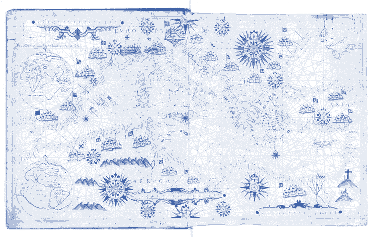
Portolan chart. Giovanni Battista Cavallini, Livorno, 1639.
rawing everything on a single time axis makes two things visible that a list of dates does not. The first is simultaneity, which is the whole point and is routinely destroyed by teaching history one region at a time. The second is the shape of the gaps, and the gaps are more interesting, because they are usually about which societies produced the kind of evidence the discipline was built to read.
So the entries carry notes on why an entity is contested or under-recorded, not only when it existed. That is the part I keep extending.
The Work
World History Timeline
Active
227 civilizations, states and empires as swim lanes, 10,000 BC to the present.
Grouped by continent and sub-region, each entry carrying its modern location, a one-line description, and where relevant a note on why it is a historiographic blind spot or an actively contested attribution. Hand-curated throughout rather than scraped, which is why it is 227 entries and not 2,000.
What existsTwo files, no dependencies, no build step, and it runs by opening it. Continent toggles, a zoom slider and moment navigation all work. This is the most immediately showable thing on the site and it can be embedded directly.
 rawing everything on a single time axis makes two things visible that a list of dates does not. The first is simultaneity, which is the whole point and is routinely destroyed by teaching history one region at a time. The second is the shape of the gaps, and the gaps are more interesting, because they are usually about which societies produced the kind of evidence the discipline was built to read.
